 Call Us: 1-480-396-0380 Proxy Bid Form Here! Press Here to join our Mailing List!
So what are Site Shapers? They are quick installs of Joomla combined with all the modules, content, etc used on our demo, excluding stock photography. Within a few minutes you can have your site up, running and looking just like our demo. No more importing SQL dumps and installing modules. Just head on over to the download section of this template and grab a Site Shaper. Simply install the Site Shaper like any other Joomla installation, it's that easy!
How to setup a Site Shaper
- Login to your cpanel or your server admin panel.
- Locate the area where your databases are (usually labeled Mysql Databases)
- Create a new database
- Next create a new database user and assign it to this newly created database in the previous step
- You will then need to extract the site shaper to either a folder on your server or the root directory such as WWW. NOTE: if you already have a website in the root of your WWW folder, we suggest creating a new folder and extract the site shaper there. If your cpanel does not have an extract option or you cannot find it, you may also extract the contents of your site shaper in to a folder on your desktop and upload all the files via an ftp client to your server.
- Next, navigate to the url where you extracted the site shaper via your web browser.
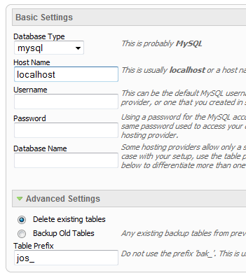
- Continue through each screen until you reach the below screenshot:
- At the above screen be sure to enter localhost as shown, continue to fill in the following text fields with your newly created database and username information
- Follow through the rest of the site shaper setup and click the install sample data at the last screen and the installation is complete! (be sure to rename/remove the installation directory after finishing the install)
SEO - Get your site noticed!
Not only is this template beautifully designed but it is great for search engine optimization as well! What is SEO? It is simple the act of altering a web site so that it does well in the organic, crawler-based listings of search engines such as google.com. How does this template accomplish this? It's simple, the majority of your most valuable content is found in the main body of your site, through css we are able to alter the layout of the site and call the main content before the left and right columns are called. This allows for your content to be found first by search engines before it reaches your other content, which is vital in search engine optimization. This is a common feature this can be done with almost all of Shape 5 templates as well.
Features at a glance:
- Fully responsive width and bottom boxes.
- Responsive re-distribution. Configure the bottom boxes to re-size at your own specified page widths.
- Fading transition.
- Width of boxes (set individually).
- Margins of both top and bottom area.
- Show between 2 and 9 boxes, that can be split into multiple rows.
- Set the background position and repeat of each box.
- Choose to cycle the boxes automatically or manually.
- Choose the display time.
- Use any image for the boxes and top area.
- Create hyperlinks for the boxes or top area.
- Open hyperlinks in a new window or same window.
- Insert your own HTML code.
The module holds up to 10 actual module positions so you can publish any of your favorite modules to one of the slides and keep your site clean and consolidated while giving it some eye candy. So simply publish the s5 tab show module to your desired module position and pages. Then start publishing modules to the positions in the tab show (s5_tab1, s5_tab2, etc); these modules will become the slides.
This menu system works off of the core Joomla jquery/mootools scripts so no extra javascript library is needed and keep download sizes to a minimum. Also, if you do not want to use this menu you can simply turn it it off from the template configuration page.
Take your website to the next design level by using the robust and feature rich S5 Flex Menu System. Organize your links with ease and show content in places you never could before!
Menu Features:
- Automatic onclick functionality for tablet sized touch screens. If a device's screen is detected as touch screen and is of table size, then the menu will function with an onclick method rather than the onmouseover effect that is shown on a laptop or desktop that has a mouse for use.
- Multiple javascript effects such as fade, slide, etc.
- Multiple columns for menu items or modules.
- Modules load directly into the menu.
- Group sub menu items into the same column or fly out.
- Optional sub texts for each menu item.
- Optional menu icon images for each menu item.
- Automatic multi-language menu change. If you are setting up a multi-language site, the flex menu will automatically change if your site's visitor has a language specific menu setup for their language in the menu manager.
- And much more!
Menu Screenshot:

UPCOMING AUCTION |
UPCOMING AUCTION |
 Subscribe to RSS Feed
Quick Menu
Additional Information
We spent a long time listening to you while developing our new website. While the old site has served us well over the years it did not have the ability to adapt to the many different devices that are available today. Our new site was developed with the future in mind. It can adapt to mobile and tablet resolutions as well as the myriad of display options available on modern LCD monitors.